
Free device preview
See your website on every screen
Not a mock-up and not a guess — we load your actual site on a desktop, laptop, tablet, phone and watch, and hand you the picture. Most owners have never seen all five at once.
- Your real pages, rendered at each device’s true resolution
- One high-resolution image, yours to download and use anywhere
- No watermark, no credit line, nothing to sign up for
- Ready in about a minute
Make my preview
We’ll text or email a one-time code, then start rendering.
Starting…
What you get
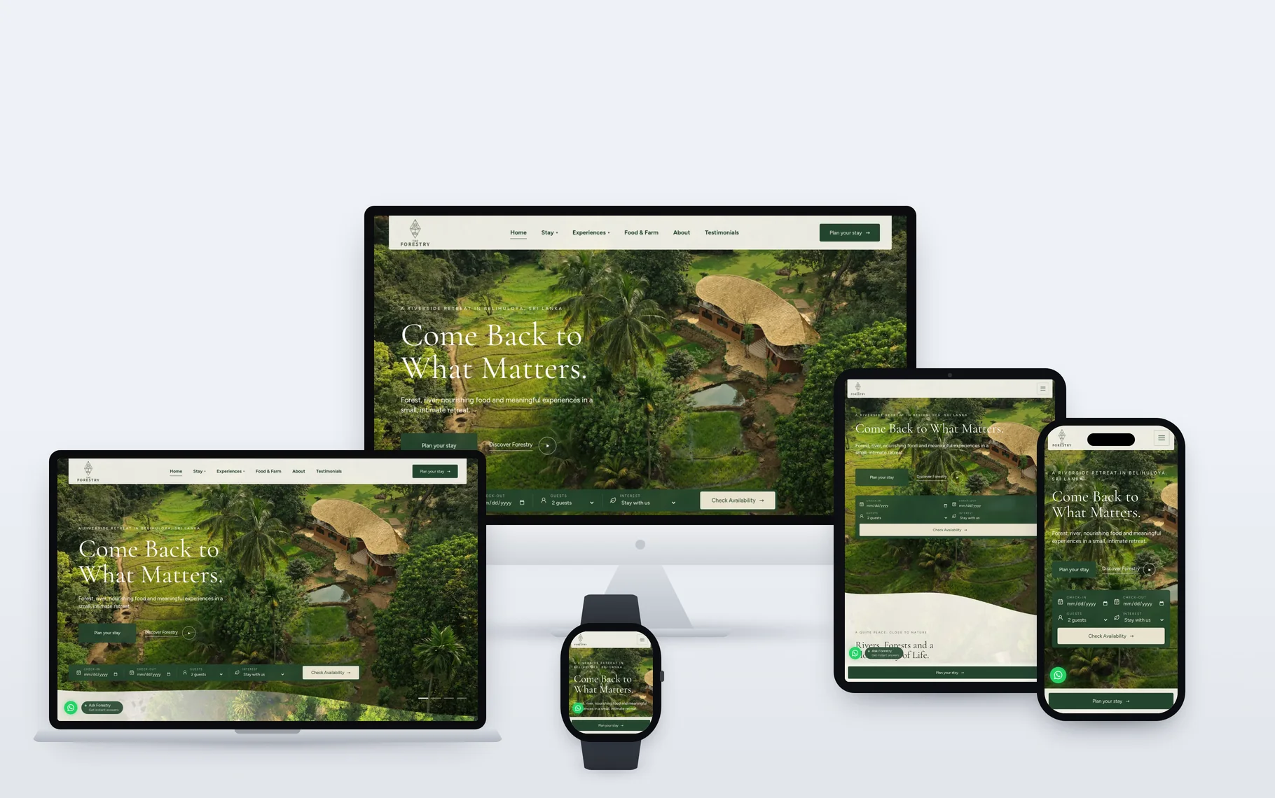
An image like this one, of your own site. It is the same showcase we build for client case studies — the devices are rendered, not photographed, so every screen shows your live pages exactly as a visitor would see them.
Why this isn’t a mockup generator
Most "device mockup" tools load your site in an iframe and scale it with CSS. We open your site in a real Chrome browser at each device’s own resolution — which is why this works on sites those tools show as a blank box.
It works on sites that refuse frames
Plenty of sites send X-Frame-Options or a frame-ancestors policy, which tells a browser never to load them inside another page. An iframe-based tool gets an empty rectangle. A real browser visiting the URL has no such problem.
Your JavaScript actually runs
Sliders advance, lazy images load, animations settle, web fonts arrive. We wait for the network to go quiet before capturing, and sweep the full page height first so nothing below the fold is still a grey placeholder.
Real breakpoints, not a shrunk desktop page
Each device gets its true viewport, pixel density and — on the phone — its own user agent. So your mobile menu, your mobile-only markup and your media queries fire exactly as they do for a visitor, instead of being a desktop layout squeezed into a phone outline.
Five captures, composed as one
All five screens are captured in the same pass and placed on one surface with matching light and shadow. Nothing is pasted in afterwards, so what you see is one consistent moment of your site.
The honest downside: because it is a real browser on a real page, a slow site takes longer and a broken one looks broken. That is the point.
Questions
Can I actually use the image?
Yes — on your site, in a deck, on social, in a pitch. No watermark and nothing to credit. It is a picture of your own website.
Is this a real render or a template?
Real. We load your site in a headless browser at each device’s true resolution and composite the results. What you see on the watch is genuinely what your site does at that width.
What if my site looks broken on one of them?
Then you have learned something worth knowing. That is usually the honest reason to run this — reply to the email and we will tell you what is causing it.
How many can I make?
Two a day per email or phone number. Each one drives a real browser for a minute, so the cap keeps it sustainable.